
The colors we surround ourselves with do more than simply decorate our spaces—they actively influence our thoughts, feelings, and behaviors. At Bosco Paints, we understand the powerful psychology behind color choices and how they can transform not just the look of your home, but also how you feel within it.
The Science Behind Color Psychology
Color psychology is more than just subjective preference—it’s backed by scientific research showing that different colors can:
- Trigger physiological reactions like changes in blood pressure and respiration
- Evoke emotional responses ranging from calmness to excitement
- Affect productivity, creativity, and concentration
- Influence perceived temperature and spatial dimensions of a room
Let’s explore how specific colors from Bosco Paints’ exclusive collections can be strategically used throughout your home to create your desired atmosphere.
Warm Colors: Energizing and Inviting
Red: Passion and Energy
Red raises the energy level of a room, stimulating conversation and creating excitement:
- Where to use it: Dining rooms, entertainment spaces, or as an accent in otherwise neutral rooms
- Bosco Paints recommendation: “Crimson Charm” for bold statements or “Rustic Rose” for a more subdued effect
- Psychological effect: Stimulates appetite, encourages social interaction, creates feelings of passion
Orange: Enthusiasm and Creativity
Orange combines the energy of red with the cheerfulness of yellow:
- Where to use it: Creative spaces, exercise rooms, play areas
- Bosco Paints recommendation: “Sunset Glow” for vibrant energy or “Terracotta Dream” for a more earthy, grounded feeling
- Psychological effect: Promotes enthusiasm, stimulates creativity, encourages playfulness
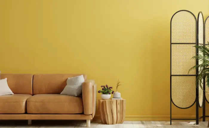
Yellow: Optimism and Clarity
Yellow captures the joy of sunshine, creating feelings of happiness and mental stimulation:
- Where to use it: Kitchens, breakfast nooks, home offices
- Bosco Paints recommendation: “Morning Light” for bright spaces or “Golden Honey” for a warmer, more subtle effect
- Psychological effect: Enhances concentration, accelerates metabolism, promotes optimism
Cool Colors: Calming and Refreshing
Blue: Serenity and Focus
Blue evokes feelings of calm and promotes intellectual thought:
- Where to use it: Bedrooms, bathrooms, study areas
- Bosco Paints recommendation: “Ocean Depth” for rich sophistication or “Tranquil Sky” for light airiness
- Psychological effect: Lowers blood pressure, reduces anxiety, improves focus and productivity
Green: Balance and Renewal
Green strikes a perfect balance between stimulation and calm:
- Where to use it: Any room seeking a natural, balanced feeling—living rooms, bedrooms, sunrooms
- Bosco Paints recommendation: “Forest Retreat” for connection to nature or “Mint Whisper” for gentle refreshment
- Psychological effect: Reduces stress, promotes restfulness, encourages balance
Purple: Creativity and Luxury
Purple combines the calm of blue with the energy of red:
- Where to use it: Bedrooms, meditation spaces, creative studios
- Bosco Paints recommendation: “Royal Velvet” for drama and luxury or “Lavender Mist” for gentle tranquility
- Psychological effect: Stimulates imagination, promotes contemplation, encourages spiritual awareness
Neutral Colors: Versatility and Sophistication
White: Purity and Spaciousness
White creates a sense of spaciousness and possibility:
- Where to use it: Small spaces, minimalist designs, art galleries
- Bosco Paints recommendation: “Fresh Canvas” for pure white or “Warm Ivory” for softer appeal
- Psychological effect: Promotes cleanliness, creates feelings of possibility, enhances other colors
Gray: Sophistication and Calm
Gray offers sophisticated neutrality without the starkness of white:
- Where to use it: Living rooms, home offices, contemporary spaces
- Bosco Paints recommendation: “Platinum Elegance” for cool sophistication or “Warm Granite” for cozier feel
- Psychological effect: Creates feelings of stability, serves as an excellent backdrop, calms without cooling
Brown: Groundedness and Comfort
Brown connects us to earth and nature, creating warmth and security:
- Where to use it: Living areas, dens, rustic spaces
- Bosco Paints recommendation: “Rich Mocha” for depth or “Gentle Taupe” for versatile neutrality
- Psychological effect: Promotes feelings of security, creates comfort, grounds energy
Strategic Color Implementation
For maximum psychological impact, consider these application strategies:
Color Intensity Matters
The intensity of a color significantly affects its psychological impact:
- Bright, saturated colors stimulate
- Muted, desaturated colors soothe
- Bosco Paints tip: Adjust intensity based on the room’s purpose and natural lighting
Creating Balance with the 60-30-10 Rule
For harmonious color psychology:
- 60% of the room should be a dominant color (usually walls)
- 30% should be a secondary color (furniture, large accents)
- 10% should be an accent color (accessories, small details)
Testing Before Committing
Because individual responses to color can vary:
- Use Bosco Paints’ sample pots to test colors in your actual space
- Observe how the color affects your mood at different times of day
- Consider how the color makes you feel after extended exposure
At Bosco Paints, our color consultants are trained in color psychology and can help you create a home that not only looks beautiful but also supports your emotional and psychological well-being. Visit our showroom to explore our thoughtfully curated color collections and discover the perfect palette for your unique lifestyle and needs.